


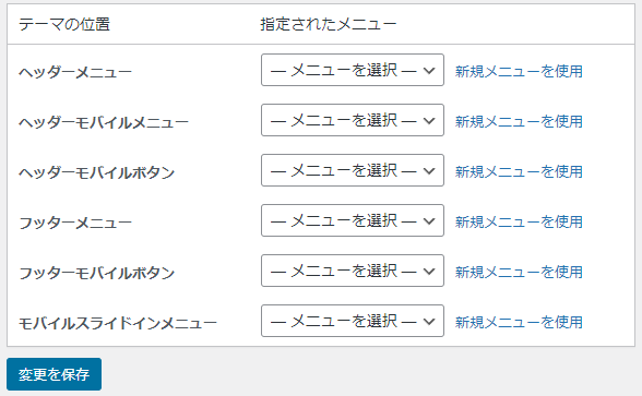
まずメニュー設定の
「ヘッダーモバイルメニュー」にメニューを追加。
テーマファイルエディターの「style.css」の
/1023px以下/
@media screen and (max-width: 1023px){}に
下記コードを追加すればOK。
ul.menu-mobile{
引用元:https://tsutchii.com/cocoon-mobile-header-customize
overflow-x: auto;
overflow-y: hidden;
display: flex !important;
flex-wrap: nowrap;
font-size: 14px;
justify-content: flex-start;
padding: 0 1em;
-webkit-overflow-scrolling: touch;
position: relative;
}
ul.menu-mobile > li{
padding-right: 1em;
white-space: nowrap;
}
ul.menu-mobile .item-label{
white-space: nowrap;
font-size: 14px;
}
参考サイト

【Cocoon】モバイル(スマホ)ヘッダーのカスタマイズ(背景画像・レイアウト設定など)
WordPressテーマ「Cocoon」のモバイル(スマホ)のヘッダーのカスタマイズ方法を、設定のパターン別にまとめました。ロゴやヘッダー画像を使った場合の実際の表示も紹介しています。自分の希望に合ったスタイルにするために、設定と表示スタイ...
tsutchii.com